Advanced Search
Description
Advanced Search can be used to create a custom search interface for searching the Grid. Search fields are added on-demand with options to customize the of control -- e.g. textbox, dropdown list, radio buttons, date range, etc -- shown to the user. Searches can also be saved and loaded by enabling the application Repository in the Web Project Properties.
Discussion
When you define a Grid component with a Search Part, you (the developer), pick the fields that you want the user to be able to search in at run-time.
With Advanced Search, however, you let the user pick the fields that they want to search in (the fields from which the user is allowed to pick is controlled by you - the developer).
The searches that are entered into the Advanced Search feature can be saved and then later retrieved.
The controls that the Advanced Search feature can display are:
- textbox - a simple input control where the user can type search values
- datepicker - an input control with a button to display a date picker
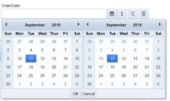
- daterangepicker - an input control where the user can enter a date range (e.g. 11/1/2018..11/15/2018). The user can click an icon to show the date picker. The date picker will have two calendars - one for the start data and one for the end date.
- step - an input control with + and - buttons to the right of the input control. Clicking these buttons will increase or decrease the value shown in the input control by 1. Typically used for integer fields.
- switch - a switch control. Typically used for logical fields.
- combolist - an input control with a dropdown button. If the user clicks the dropdown button a picklist is shown. The picklist can either be static data, or dynamic data (computed in an Ajax callback by querying a SQL database).
- buttonlist - a buttonlist control ( a series of buttons that the user can click to select). The buttonlist can be configured to only allow a single button to be clicked (radio button style behavior), or to allow multiple buttons to be clicked (checkbox style behavior). The choices for the buttonlist are statically defined.
- suggest - a simple input control that behaves like an auto-suggest control. The user types a value into the input control and a picklist is shown displaying choices that either start with or contain the value the user has typed in. The picklist can either be static data, or dynamic data (computed in an Ajax callback by querying a SQL database).
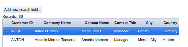
When the Grid is initially displayed, the Advanced Search control is rendered as follows:
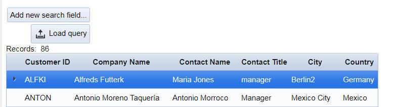
If the Allow Saved Query Load option is enabled, the Advanced Search control is rendered as follows:
All text in the buttons shown in the Advanced Search control, and the icons are fully customizable. You can also use language tags or text dictionary tags to translate strings into other languages.
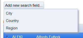
To start defining a new search, the user will click the Add new search field button. This will display a drop down menu of the fields from which the user can select. This list of fields (and the corresponding control type to use for the field) is defined when the Advanced Search is configured.
For example:
The user will select one of the available fields and a new search control is added to the screen. At this point, the Advanced Search control will look like this:
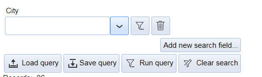
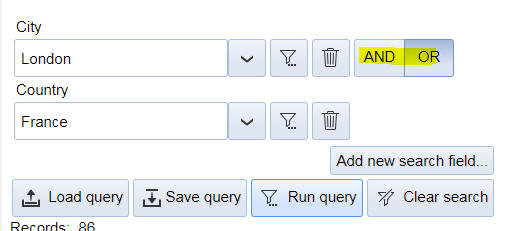
The user can continue adding as many additional search fields as needed. When a second or subsequent search field is added, the Advanced Search control shows AND/OR buttons for each search field (except the last selected field). This allows you to specify if the search items are joined with an AND operator or an OR operator. In the example shown below, the search is for City = 'London' OR Country = 'France'.
Each new item added to the Advanced Search control will have these two icons:

The trash can icon is used to delete the item from the Advanced Search control.
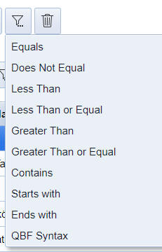
The funnel icon is used to set search options for the field. When the user taps this icon, a menu with these options is shown:
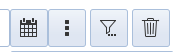
For Date and Time fields (Time is actually a Date-time field), an additional button (with 3 vertical dots) is shown. This is the date menu button.
When the user clicks the date menu button, a menu of pre-defined date ranges is shown. For a datepicker control, the choices in the menu are:
- Today
- Tomorrow
- Yesterday
For a daterangepicker control, the choices in the menu are:
- This Week
- This Week-to-date
- Next Week
- Next 7 Days
- This Month
- This Month-to-date
- Last Week
- Last 7 Days
- Last Month
- Last 30 days
- Next Month
- Next 30 days
- This Year
- Last Year
- Next Year
- This Year-to-date
- This Quarter
- This Quarter-to-date
- Last Quarter
- Next Quarter
When the user clicks on the Calendar icon for a daterangepicker control, the dropdown window shows two calendars so the user can select the start date and the end date for the date range.
The menu options determine the type of search that is performed. For example, say you have added an item to the Advanced Search control to search in the LastName field and you have entered JO into the input control. If you set the menu to Starts with then records where Lastname is Jones or Johnson will be selected.
The QBF Syntax allows the user to use the standard QBF syntax supported by Grid and UX searches. This syntax is summarized below:
- QBF Syntax
- Description
- value1,value2,...valuen
Searches for records where the search field equals value1, or value2, or valuen. e.g. London,Paris,Madrid
- value1..value2
Searches for records where the search field is >= value1 and <= value2. e.g. A..B, 123..345, 2018/9/1..2018/9/15
- ..value1
Searches for records where the search field ends with value1. e.g. Enter on in the input field. Finds records that have Johnson in the search field.
- value1..
Searches for records where the search field starts with value1. e.g. Enter jo in the input field. Finds records that have Jones, Johnson, etc.
- >value1
Finds records where the search field is greater than value1. This is the same as the Greater Than menu option.
- >=value1
Finds records where the search field is greater than or equal to value1. This is the same as the Greater Than or Equal menu option.
- <value1
Finds records where the search field is less than value1. This is the same as the Less Than menu option.
- <=value1
Finds records where the search field is less than value1. This is the same as the Less Than or Equal menu option.
- <>value1
Finds records where the search field is not equal to value1. This is the same as the Does Not Equal menu option.
- ..value1..
Finds records that contain value1 in the search field. This is the same as the Contains menu option.
The QBF Syntax allows you to enter multiple search commands, separated by comma. For example
2018/9/1..2018/9/15,2017/9/1..2017/9/15
will find records where the search field value is between September 1 and September 15 in either 2017 or 2018.
Adding an Advanced Search Control to a Grid Component
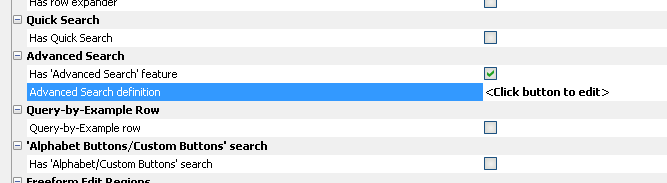
To add an Advanced Search control to a Grid component, go to the Grid Properties pane in the Grid Builder and check the Has 'Advanced Search' feature property. This will then show the Advanced Search definition property. Click the smart field for this property to open the dialog where you can configure the control. (See below for details).
It's possible, although unusual, to have both a standard Search Part in the Grid and also turn on the Advanced Search feature.
Configuring the Advanced Search
The configuration dialog for the Advanced Search is shown below. The left hand list shows the fields that the user can select from when adding a new field to the search at run-time. You can add new fields to this list by clicking on the Add new search field... button. The properties for the selected item will be shown to the right.
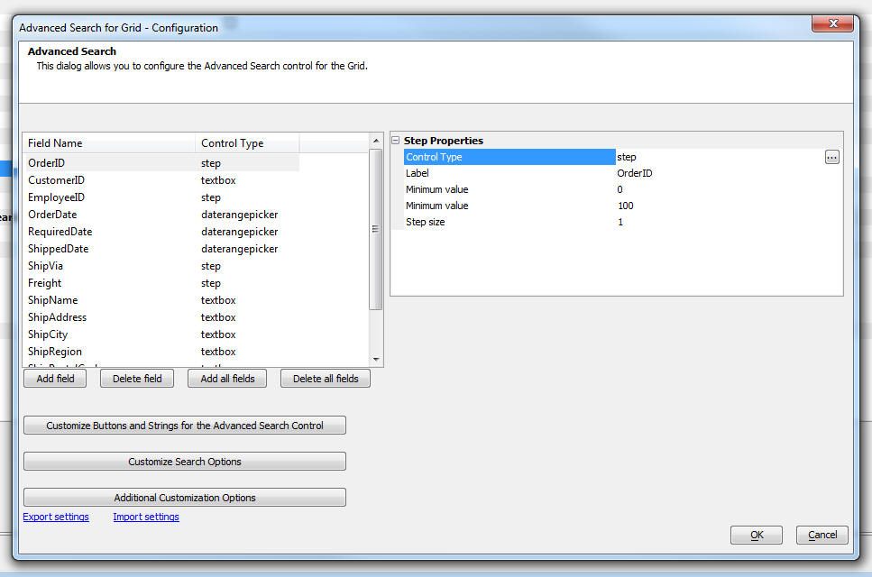
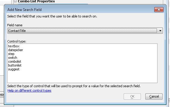
When you click on the Add Field button a dialog is shown that allows you to pick one of the available fields in the Grid component.
For each field you select, you must also select the corresponding control type for that field.
For example, if you pick a logical field, you will likely want to select the switch control for that field. On the other hand, say you pick a field called Lastname, you might want to select the suggest control for that field. This will display an auto-suggest list as the user starts typing values into the search field.
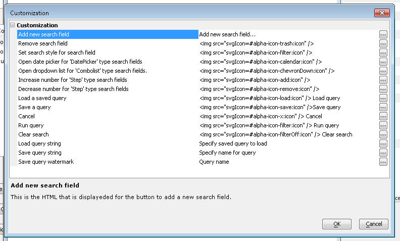
You can customize all of the icons and prompts shown in the Auto Suggest control. To do so, click the Customize Buttons and Strings for the Advanced Search Control button. This will display the dialog shown below. You can use language and text dictionary tags in the strings (e.g. <a5:r>...</a5:r> or <a5:t>..</a5:t> )
Customizing Search Options
You can customize certain aspects of the Advanced Search control by clicking the Customize Search Options button. This will display the dialog shown below:
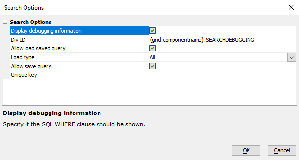
You can enable/disable the ability to save and load previously defined searches. You can also specify if debugging information should be shown. If you turn on debugging information, the WHERE clause computed from the search definition is shown, as well as the argument values for the arguments referenced in the WHERE clause.
You will need to specify the id of a DIV control where you want the debugging information to appear. You must add the appropriate DIV to your component. A convenient place to add this DIV is in the Before HTML property in the Additional Customization Options dialog (see below).
For example, in the image above, the DIV for the debugging information is specified as:
{grid.componentname}.SEARCHDEBUGGINGBy including the {grid.componentname} placeholder in the DIV id, we ensure that there will not be any conflict with the id should more than one instance of this Grid be displayed at the same time.
The Unique key property is shown if either the load or save query option is enabled. This property is added to the name of the saved query in the Repository table where queries are saved (see below for more information on Loading and Saving queries). This property allows you to ensure that when you click the Load Query button, only saved queries that match the Unique key are shown.
Summary of Search Options Properties
- Property
- Description
- Display debugging information
If checked, allows you to display the search SQL WHERE clause in a DIV on the page.
- Div ID
The DIV where the SQL WHERE clause is shown. This property is only available if Display debugging information is checked.
- Allow load saved query
If checked, displays a button the user can click to load a previously saved query.
- Load type
The Load type let's you filter which saved searches are shown when the user loads a saved search. Searches can be filtered to only those created by the user, searches created by users in the same security group as the logged-in user, or all searches saved for the Grid's Advanced Search control.
- Load type
- Description
- All
All searches saved by any user are shown.
- Only queries saved by current logged-in user
Searches created by the current user a shown.
- Only queries for the current logged-in user's security group
Searches created by anyone in the same security group(s) as the current user are shown.
Load type is only shown if Allow load saved query is checked.
- Allow save query
If checked, displays a button the user can click to save the current query.
- Unique key
A prefix used to uniquely identify all save searches for the Grid's Advanced Search.
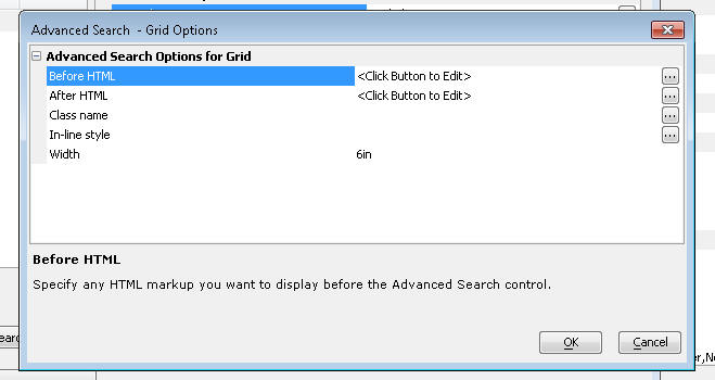
Additional Customization Options
The Additional Customization Options button provides additional configuration options to customize the Advanced Search control, including:
- Option
- Description
- Before HTML
This is any HTML markup that you want to display above the Advanced Search control. This is an appropriate place to put the HTML markup for the DIV where debugging information should be shown. For example:
<div id="{grid.componentname}.SEARCHDEBUGGING"></div>- After HTML
This is any HTML markup that you want to display below the Advanced Search control.
- Class name
This is the CSS class name for the DIV that contains the entire Advanced Search control (including the Before HTML and After HTML).
- Width
The width of the control.
Loading and Saving Queries
In order to save queries you must define a Repository table in the Project Properties dialog. To open the Project Properties dialog, click the Project Properties button in the Web Control Panel.
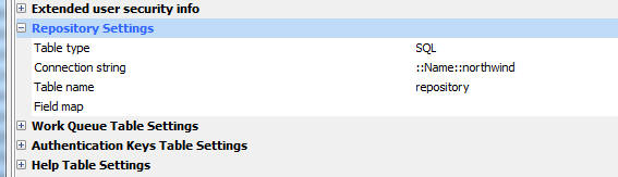
You can define the connection string to the database where the Repository table will be stored. You can link to an existing table or create a new table. Click the smart field for any of the properties to open a builder.
Configuring the Grid to Show Debugging Information
When you run a query in the Advanced Search control you can display the WHERE clause that Alpha Anywhere computed from your query definition.
To turn on debugging information check the Display debugging information property in the Customize Search Options dialog.
You will need to specify the id of a DIV element in the Grid component where the debugging information should be shown. You must manually add this DIV to the component. For example, say you specify the id or the DIV as {grid.componentname}.ADVANCEDSEARCHDEBUGINFO then you would need to add the following HTML markup to your Grid component:
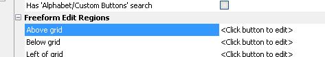
<div id="{grid.componentname}.SEARCHDEBUGGING"></div>This markup can be added in several possible places. For example in a Freeform Edit Region, in the HTML that displays above or below the Advanced Search control (see the Additional Customization Options button on the configuration dialog), etc.
Videos
Adding and Advanced Search Control to a Grid Component
The Advanced Search Control provides an alternative to the Grid Search Part for enabling users to search for data in a Grid. The Advanced Search Control has advantages over the Grid Search Part in that it allows the user to search on all of the fields in the Grid, not just the fields selected for the Search Part.
In this video we show how the Advanced Search Part is added to a Grid component and how it is configured.
P.S. You may find it helpful to watch the videos for using the Advanced Search Control in a UX component before watching the videos on using the Advanced Search Control in a Grid.
- Watch Using the Advanced Search Control in a Grid
- Watch Using the Advanced Search Control in a UX Component
See Also